Contrast — Color Accessibility
August 04, 2017 05:54
About Contrast — Color Accessibility
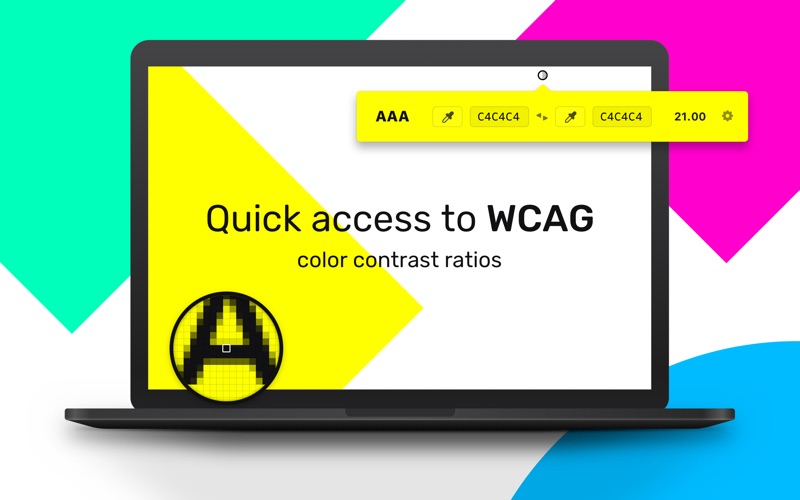
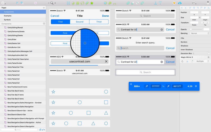
Make sure the text you're designing isn't too light in your interface designs with Contrast. Combine this simple little menu bar app with your favorite design tool and design with accessibility in mind.
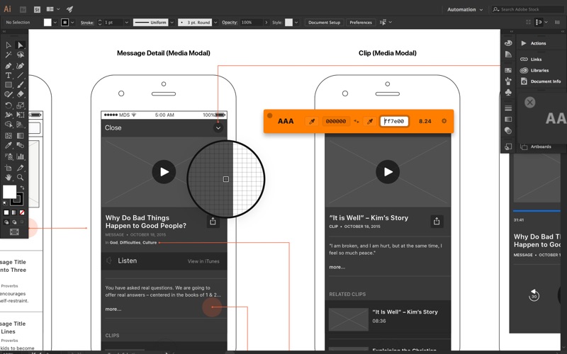
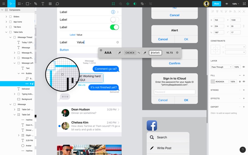
Enter hex codes manually or use the built in color picker for sampling colors directly from your designs.
Tear the app from the menu bar and use it as a floating window wherever you'd like. It'll stay on top of your active design tool for quick access to the WCAG contrast scores.
Images
Contrast — Color Accessibility is available for 6.00 usd on the App Store
Simmilar App
Comments
Search
Advertisement
26.09.2016
26.09.2016
16.09.2016
09.09.2016
07.09.2016


